Cascade Window Wash
A squeaky clean start-up in Bend, Oregon
When the owner, Josh, approached me about branding his new business, he had three main requests: create something that catches people’s attention, stand out from competitors, and include soap bubble lettering. Josh also noted he wanted the branding to feel “professional, fun, and happy,” and liked the idea of using Mt. Hood within the logo if possible.
After researching local competitors and window washing companies across the U.S., we found two very common design choices: most companies used a blue and yellow color palette, and the majority featured a squeegee, a window, or a combination of the two in the logo.
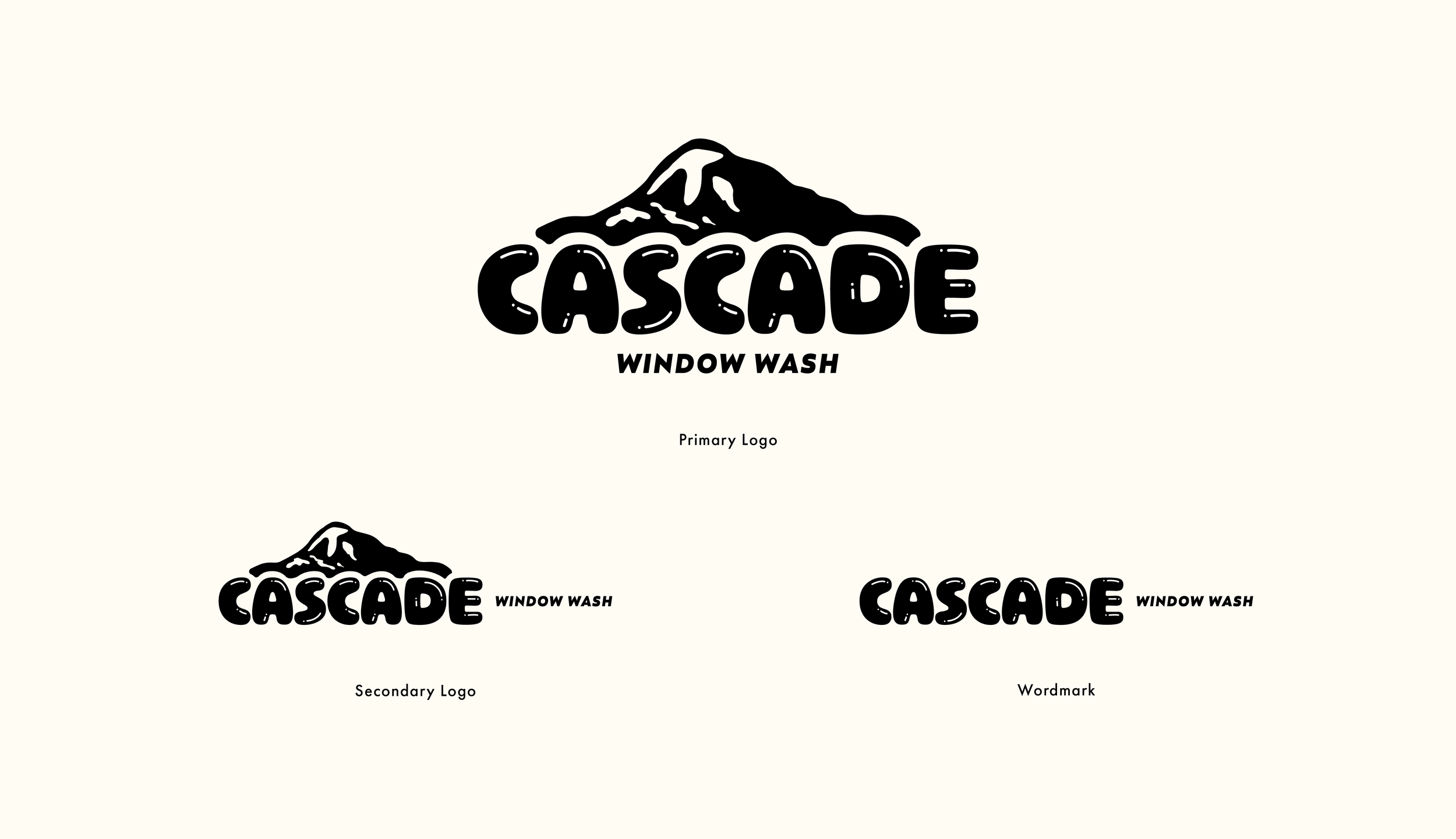
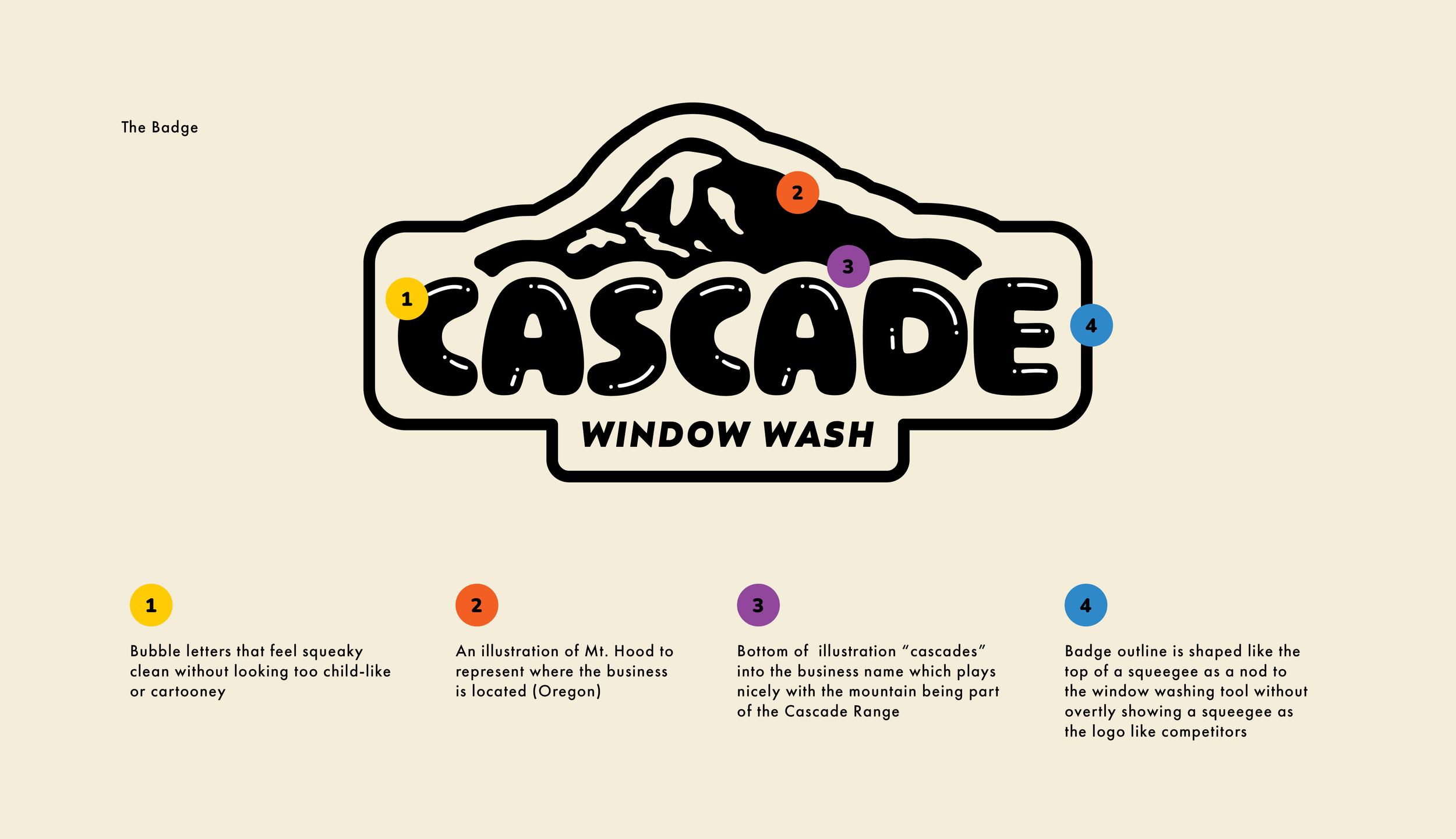
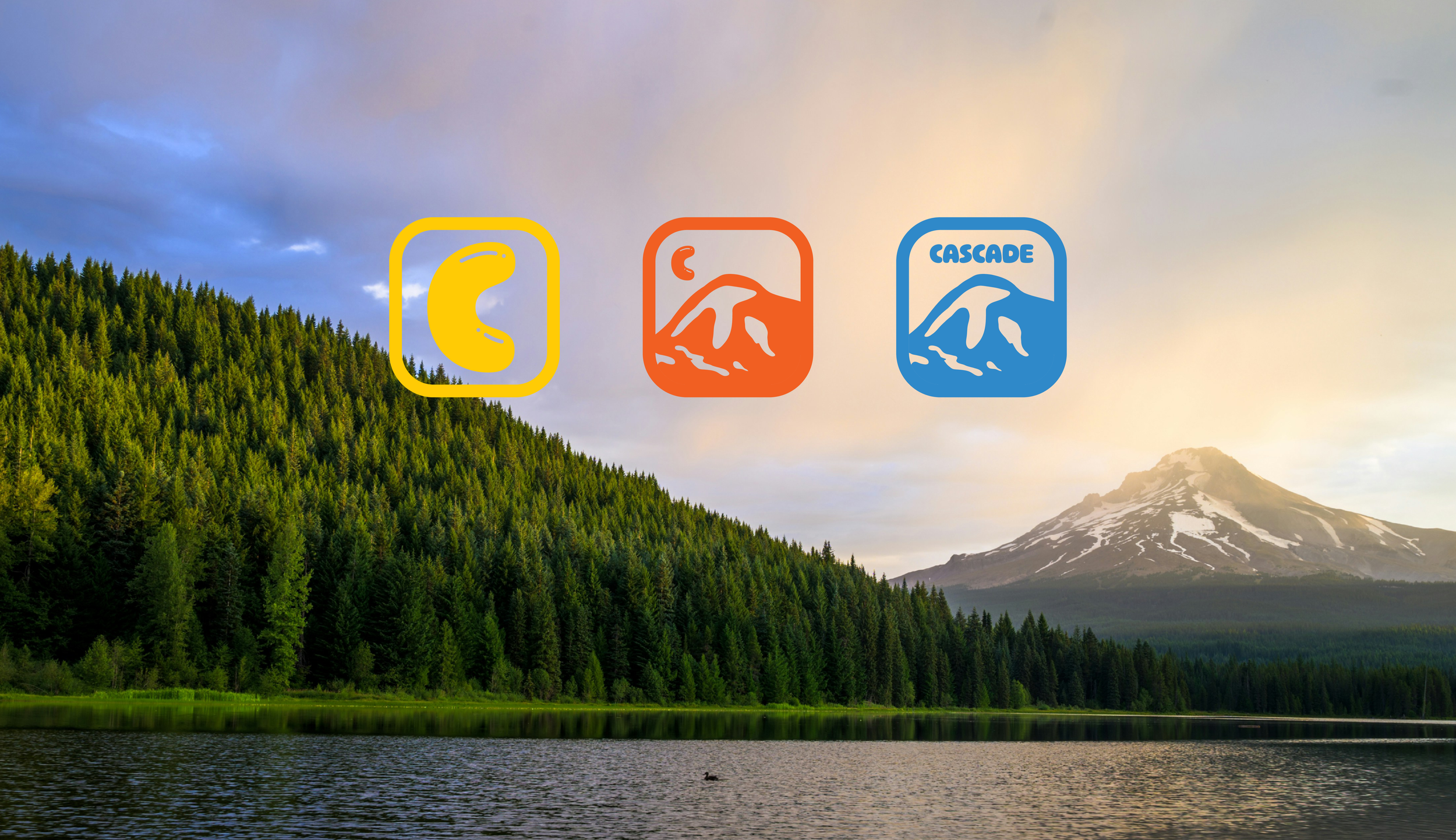
Knowing we needed to go in a different direction, we came up with the idea of illustrating Mt. Hood (part of the Cascade Range) in a shape that “cascades” down around the bubble letters. This fit perfectly with the client’s wishes to create something unique and eye-catching, feature Mt. Hood, and include bubble lettering. We liked the idea of the logo feeling a bit more like a national or state park badge because the target audience frequents parks, so we knew their eyes would naturally be drawn to that type of design. They might see it and think it’s a park at first, but it would stick with them when they realize it’s actually a window washing company. With everything combined, we accomplished the goal of having the brand feel professional, fun, happy, and unique to the window washing industry.
Services
+ Branding
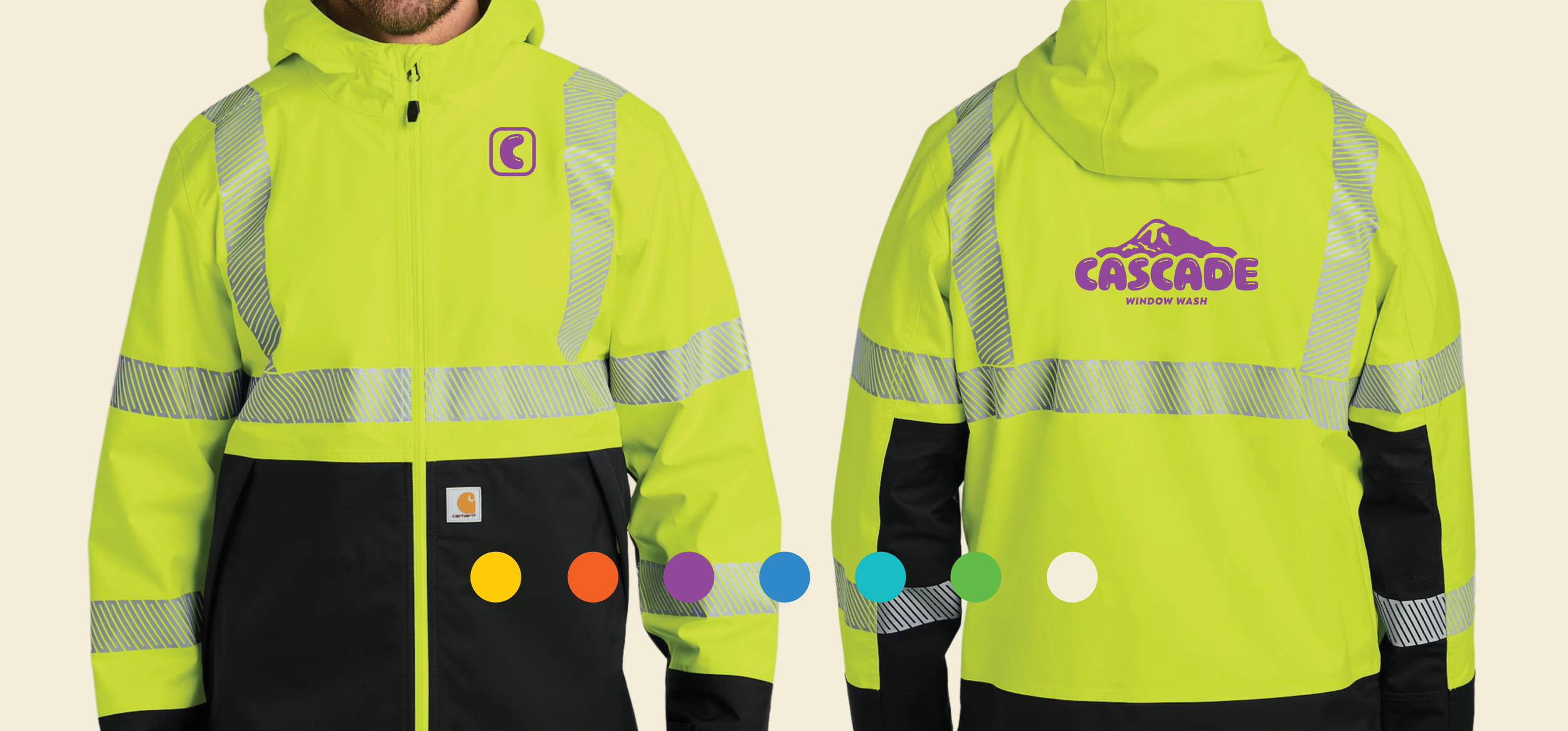
+ Apparel
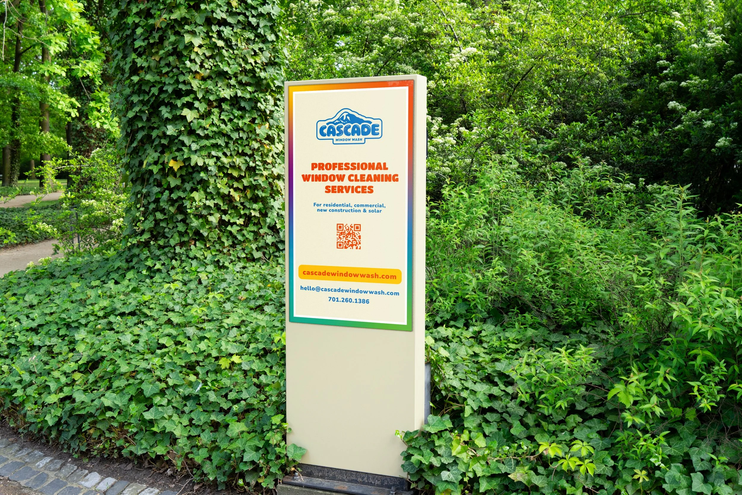
+ Signage
+ Collateral
+ Website
The Colors
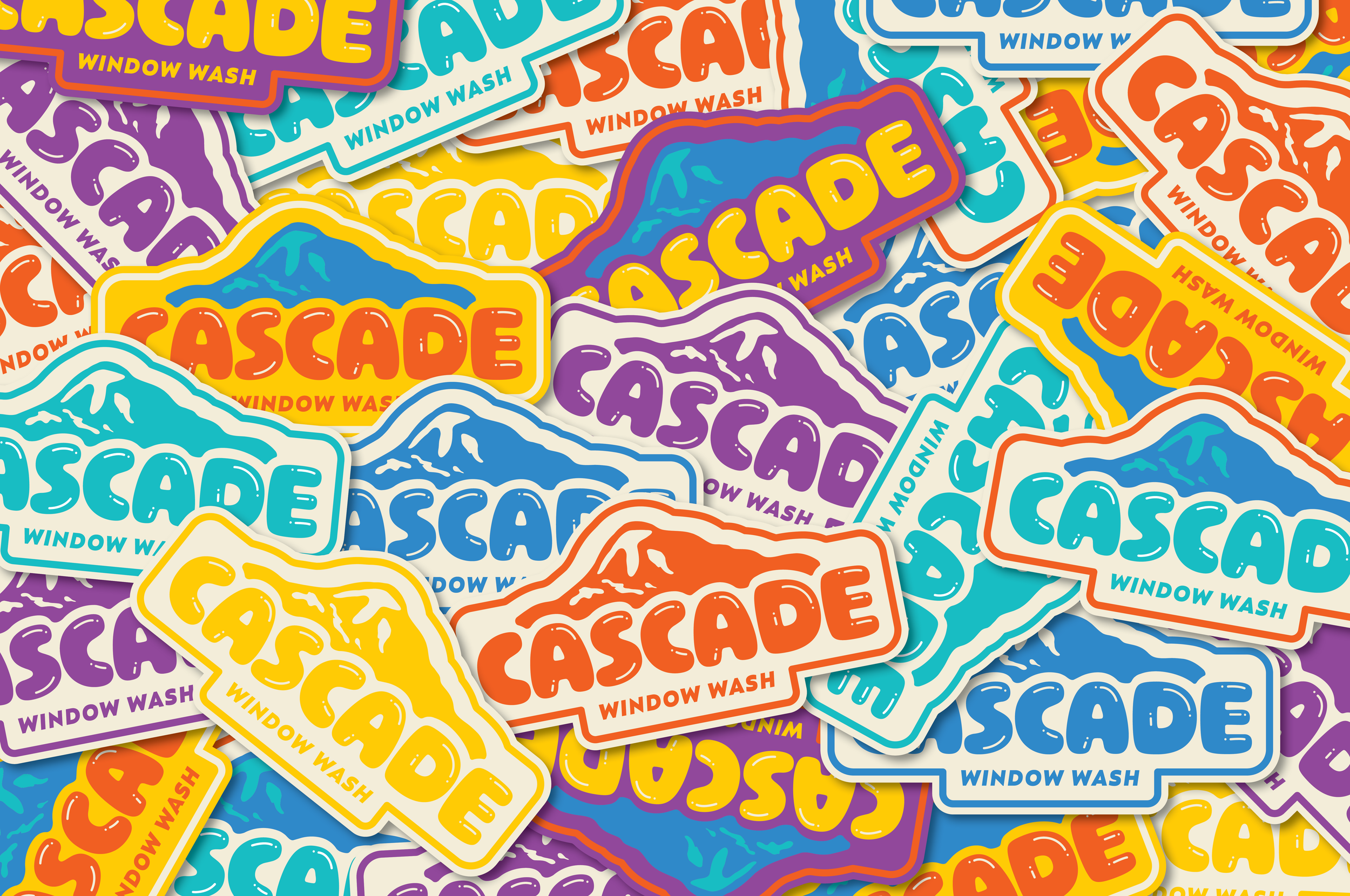
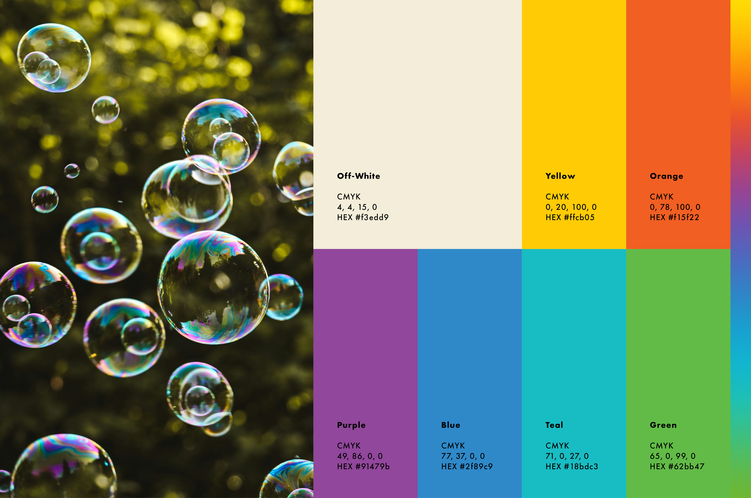
We chose to go with a bright color palette after originally playing around with some moodier combinations that felt more Pacific Northwest. The client wanted customers to feel happy when they interacted with the brand so after a first round review it felt like a seamless solution to have the color palette showcase brighter, more “happy” colors that felt fun. We were inspired by colors that naturally appear within bubbles when the sunlight hits them just right, and created the color palette using the eye dropper tool while making some adjustments until it felt juuust right.
The Typography
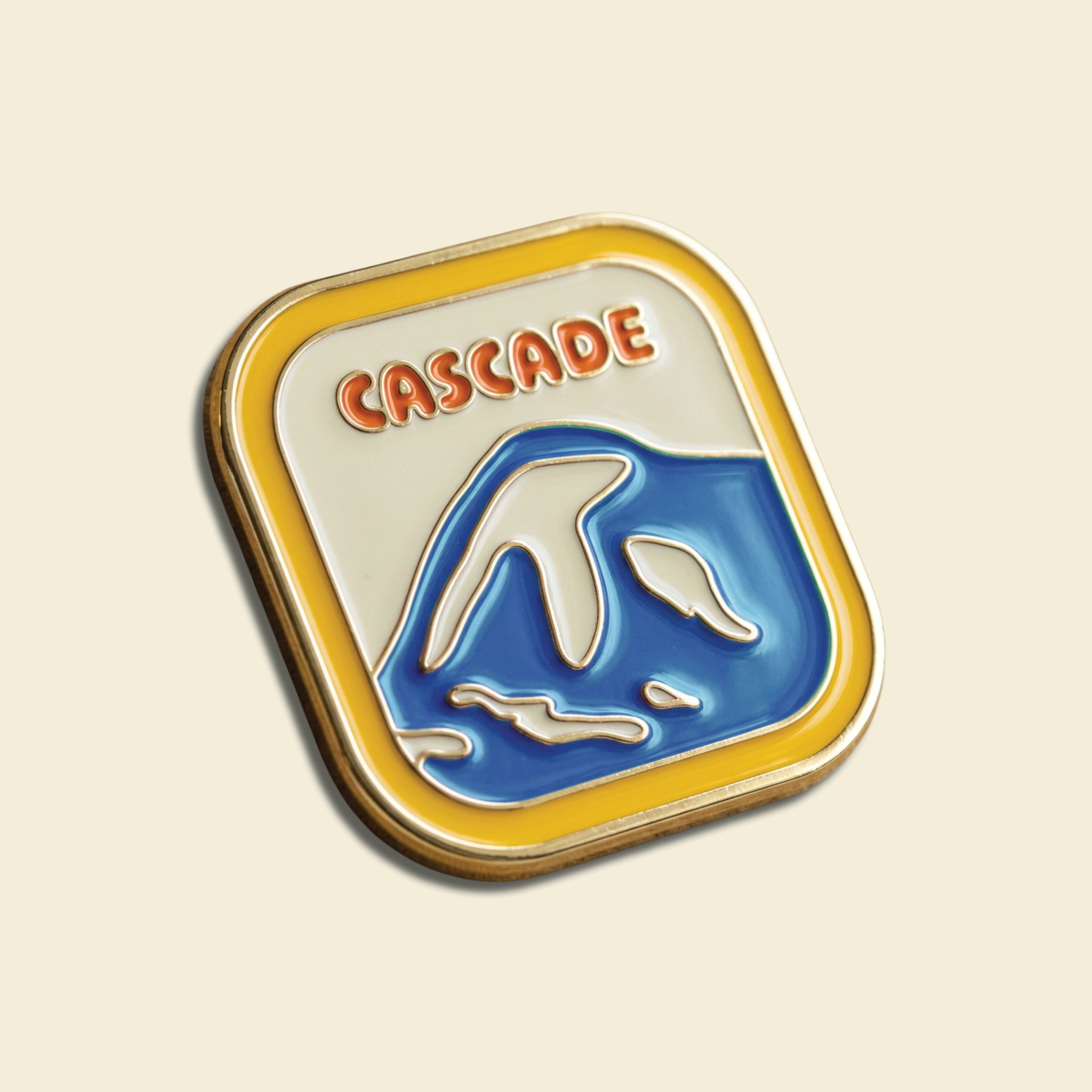
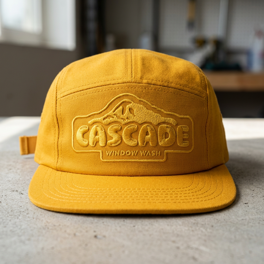
When I heard the client say they wanted “soap bubble lettering” but also wanted a professional look I knew we were in for a challenge. That is, until I remembered the perfect font from my favorite type designer, OH no Type Co. The font Ohno Softie is an extra-rounded geometric sans that works perfectly for a bubble-lettered look. Soap bubbles on the letters felt too childish so we opted to draw little strokes and dots on top of each letter to create the “squeaky-clean” look.
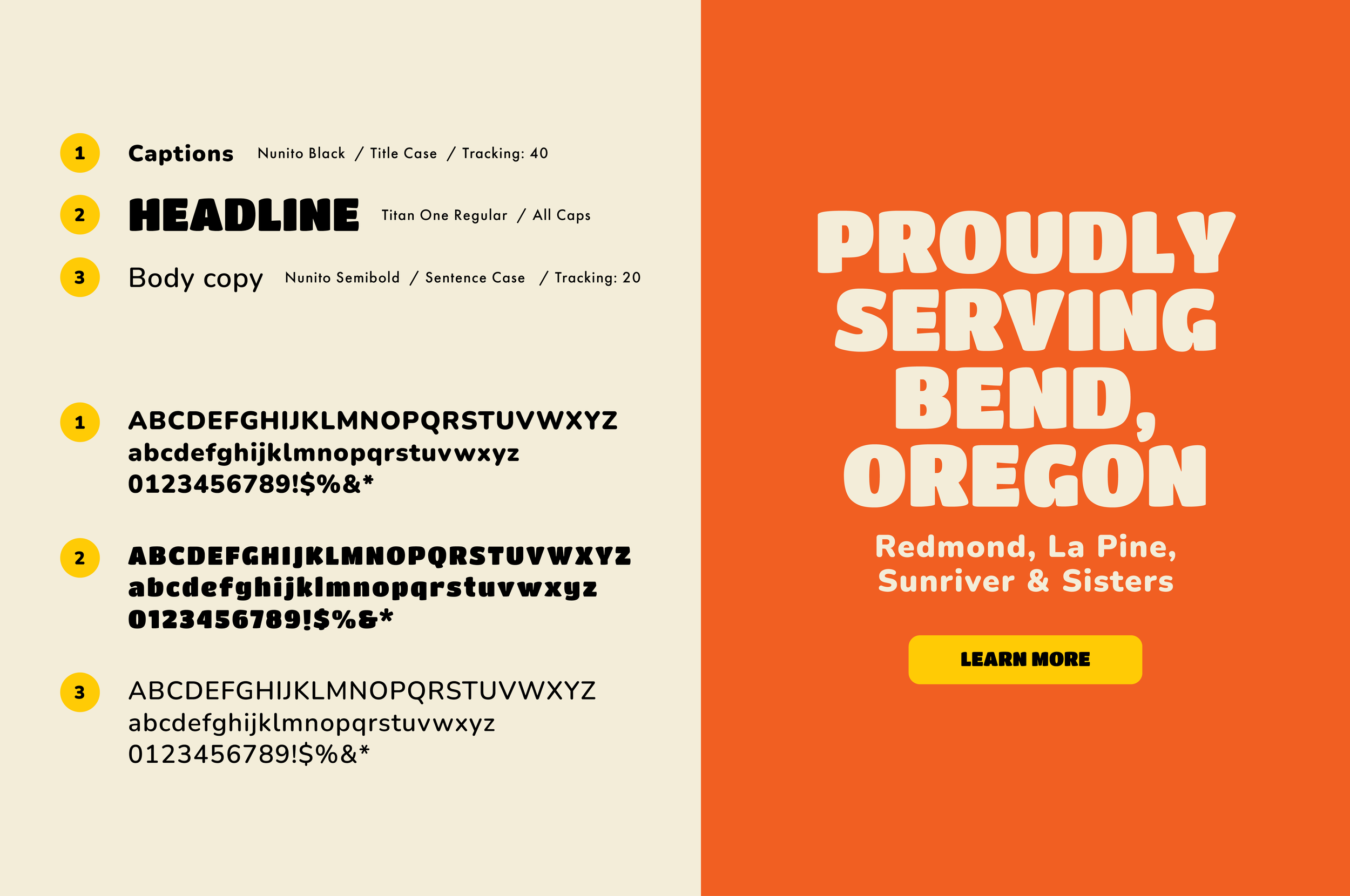
Since we were also building a website on Squarespace, we knew we needed to find complementary typefaces from Google Fonts to maintain a cohesive brand experience from print to digital work. Nunito and Titan One are a perfect font pairing to keep the brand type feeling fun and happy while carrying over the bubbliness of the logo.

The Website
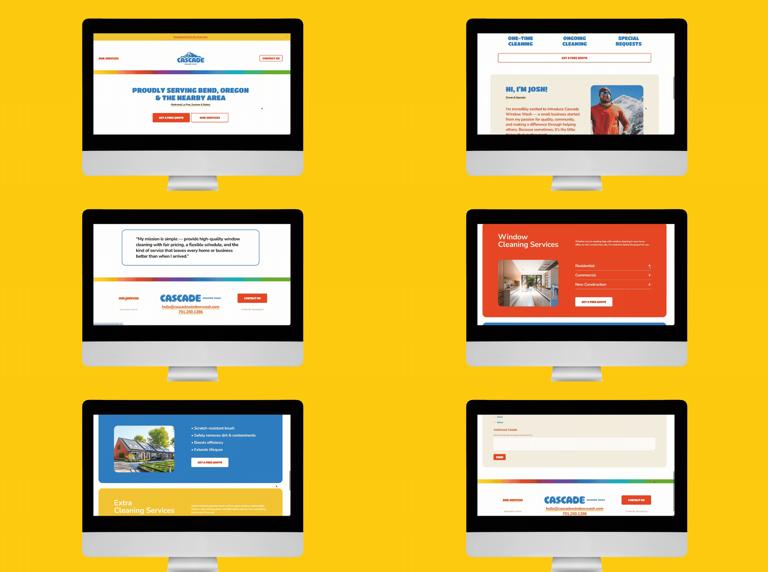
We wanted to keep the website tidy and simplified and only provide the key details that really matter to a client looking to hire a window cleaning service. With that, we designed and built out a home, services, and contact page that included a lead gen form. The client wanted it to be clear for customers interacting with the site that they would be getting a professional experience from a real person that values great customer service, fair pricing, and high-quality expert cleanings.
We talked about the inquiry form on the contact page and cut out questions that could create a longer time spent filling it out which may deter potential customers from reaching out for a quote. It was also important for the client to feel they had everything necessary to capture a qualified lead without having to ask a lot of back and forth questions once contact was made. The result is a clean, bright and easy to navigate site that leaves the user with all the right information, and none of the gunk.