Lemoine
A little western, a little Wes Anderson, a dash of quirk and lots of happy color combos.
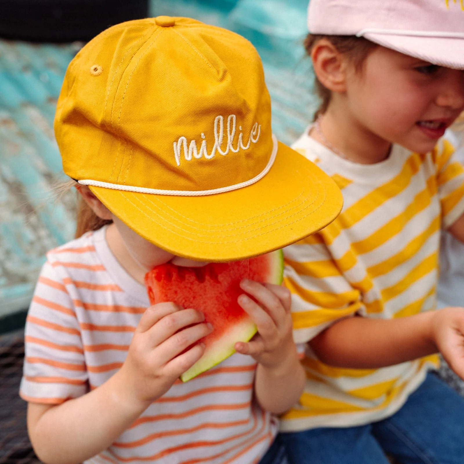
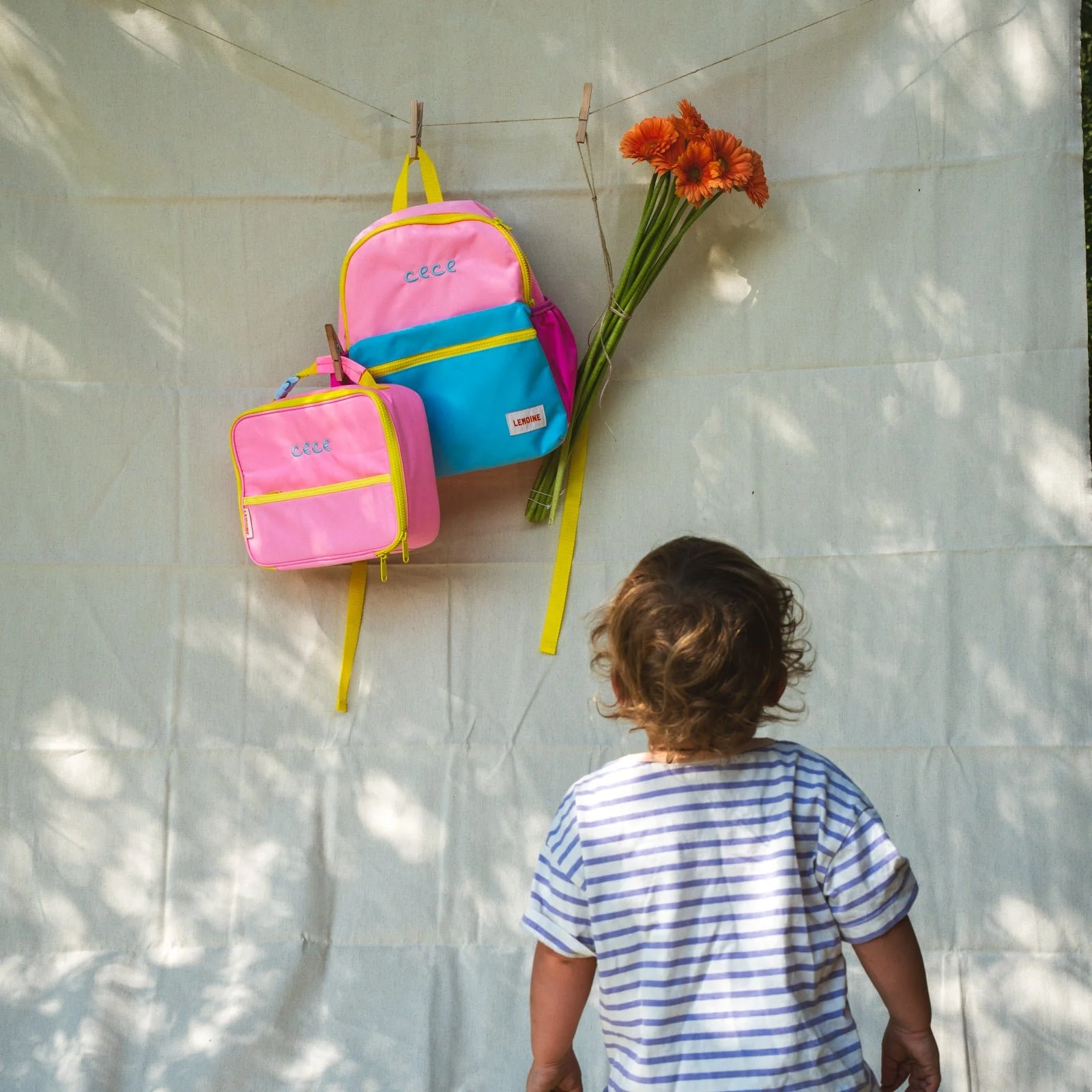
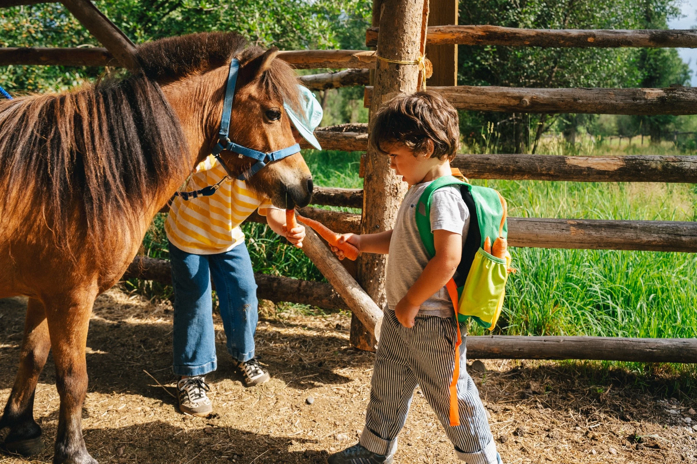
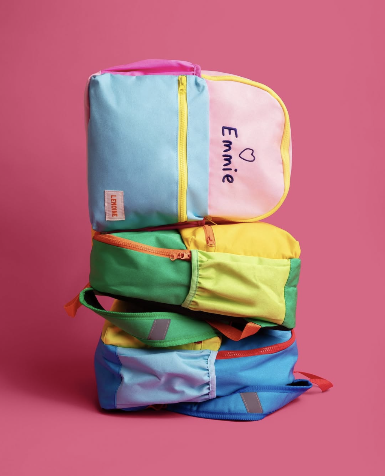
After taking over an embroidery business that leaned a little more towards the direction of many other embroidery shops (monogram everything with a hefty dose of southern charm) Leslie was in need of a new look to go along with the new direction she was taking the business. Located in Jackson, Wyoming Leslie wanted the business to feature private label goods that can be custom embroidered for a special personal touch. After having kids of her own she struggled to find cute and functional items for them — a well made hat that actually stays on a kids head, a backpack that can fit a gazillion snacks, clothes, water, AND the beloved stuffed animal, and lunch boxes that fit seamlessly into the backpack.
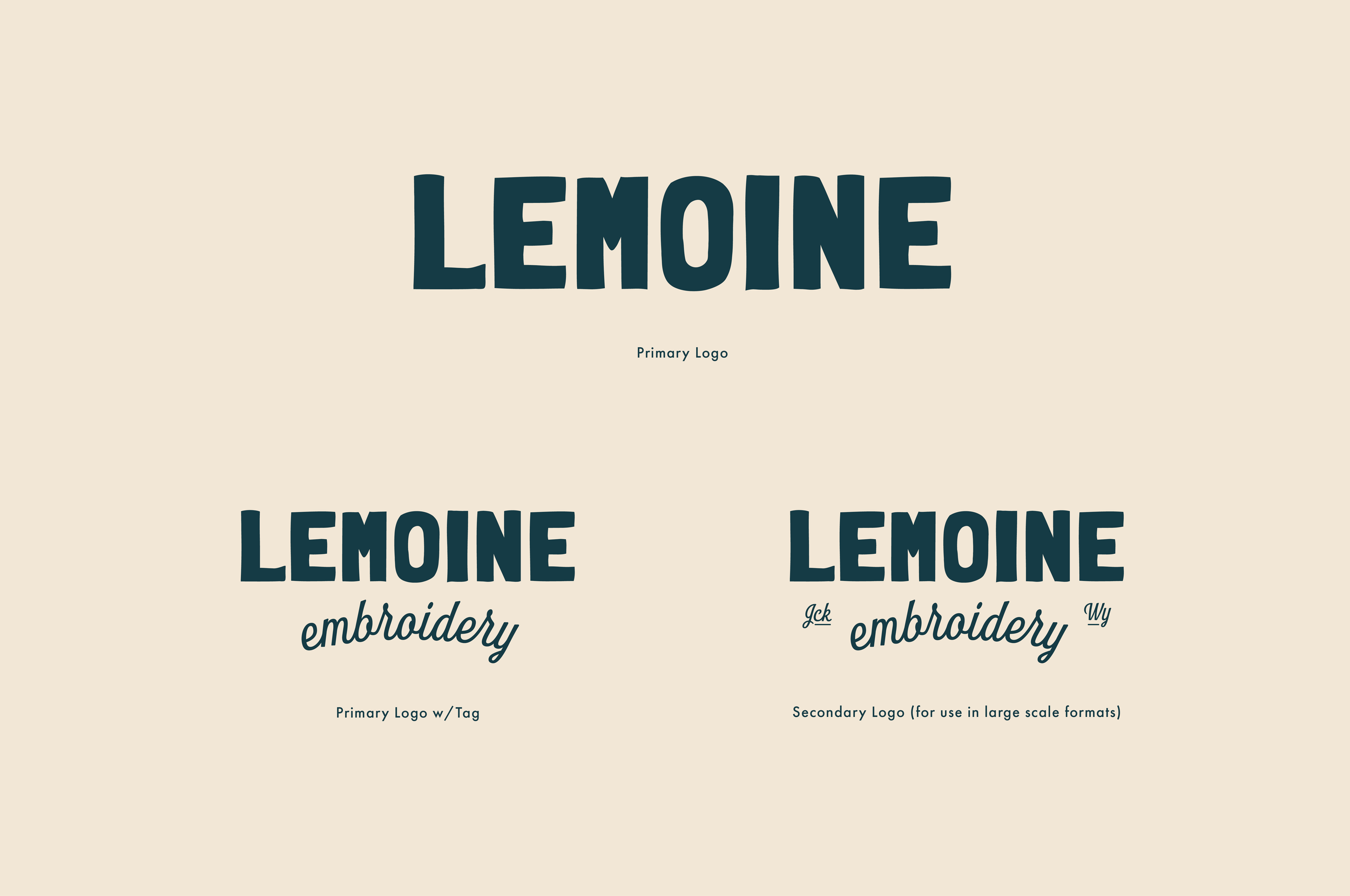
The name, Lemoine (leh-moyne), which comes from her great grandmother and is a nod to her own middle name, is as unique as her embroidery work and it was important to Leslie to have the branding reflect that uniquely quirky name she decided to give the business.
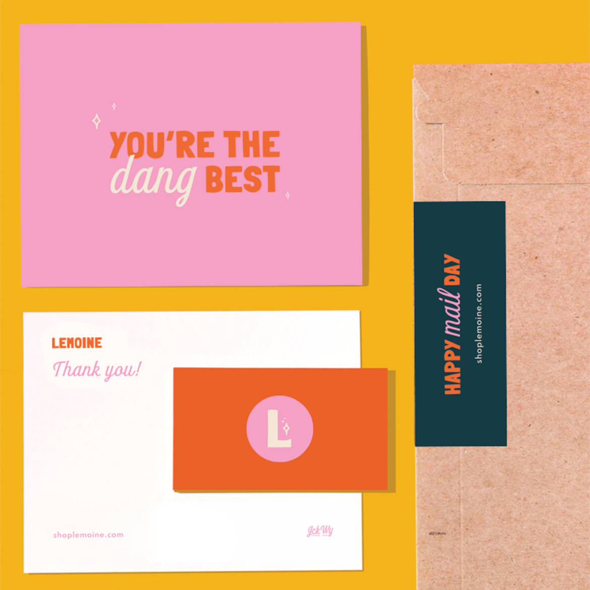
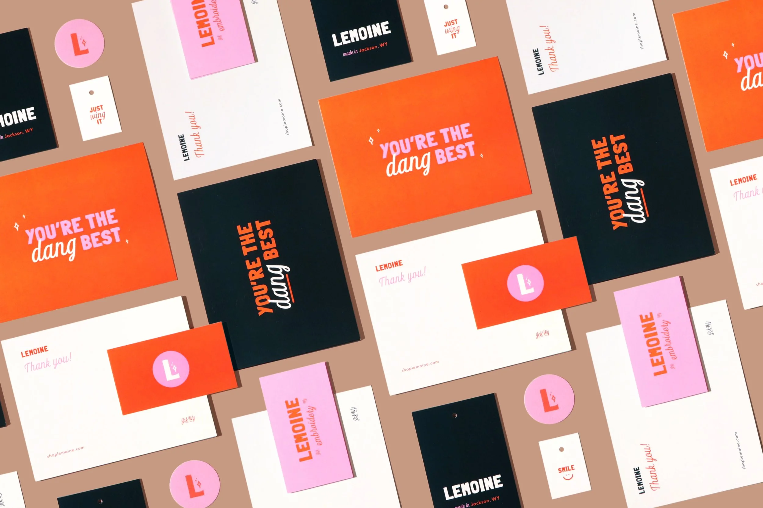
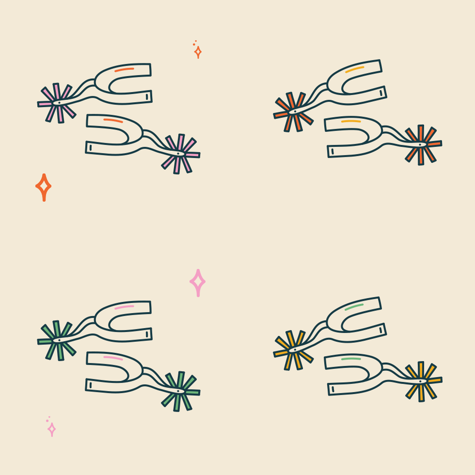
As part of the rebrand we also created packaging, hang tags, stickers, labels, pattern-work, and custom illustrations. It has been an absolute delight watching Lemoine grow over the years and seeing new products being added to her lineup. One of my favorite parts is seeing how she’s continued to carry over the branding into new colorful product launches!
Product photography courtesy of Lemoine
Services
+ Branding
+ Illustration
+ Packaging
+ Collateral

The Colors
Bright colors reflect the happy-go-lucky, good-vibes nature of the Lemoine brand. The products are meant to make you feel good and bring about a little spark of joy whenever you see them, and we wanted to infuse that feeling within the brand color palette as well. The color combos lend themselves to a variety of options to either feel more kid-like, or more quirky which works great for the Lemoine audience of people buying the embroidered goods for themselves, or parents buying pieces for their kiddos.

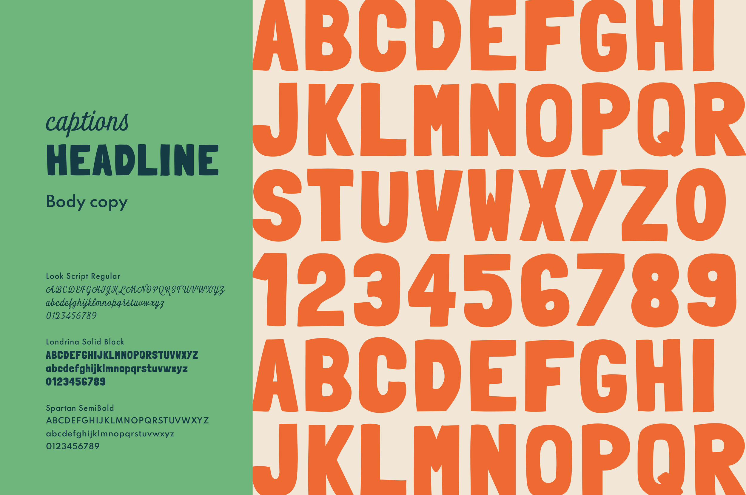
The Typography
We chose to utilize a primary typeface that feels unique to the embroidery world, kid-like, and hand-drawn as a nod to the hand-crafted nature of the embroidered goods Lemoine creates. Look Script is a playful cursive font that ties in the curly cue look of names that are often embroidered onto custom pieces, while also pairing well with the headline font, Londrina, to create a distinct look for the brand wherever marketing materials, packaging, and social posts are seen. Everything Lemoine creates is unique and it was important for the font pairings to reflect that aspect of the brand.

“I absolutely loved working with Ashley. She was so easy to work with and really brought my business and brand to life. She is super creative and produced everything on a timely basis. In addition, her excitement for my business and creating a brand made the process so much fun. I will definitely be using her for all future projects and refer her to others!”
The Packaging + Copy
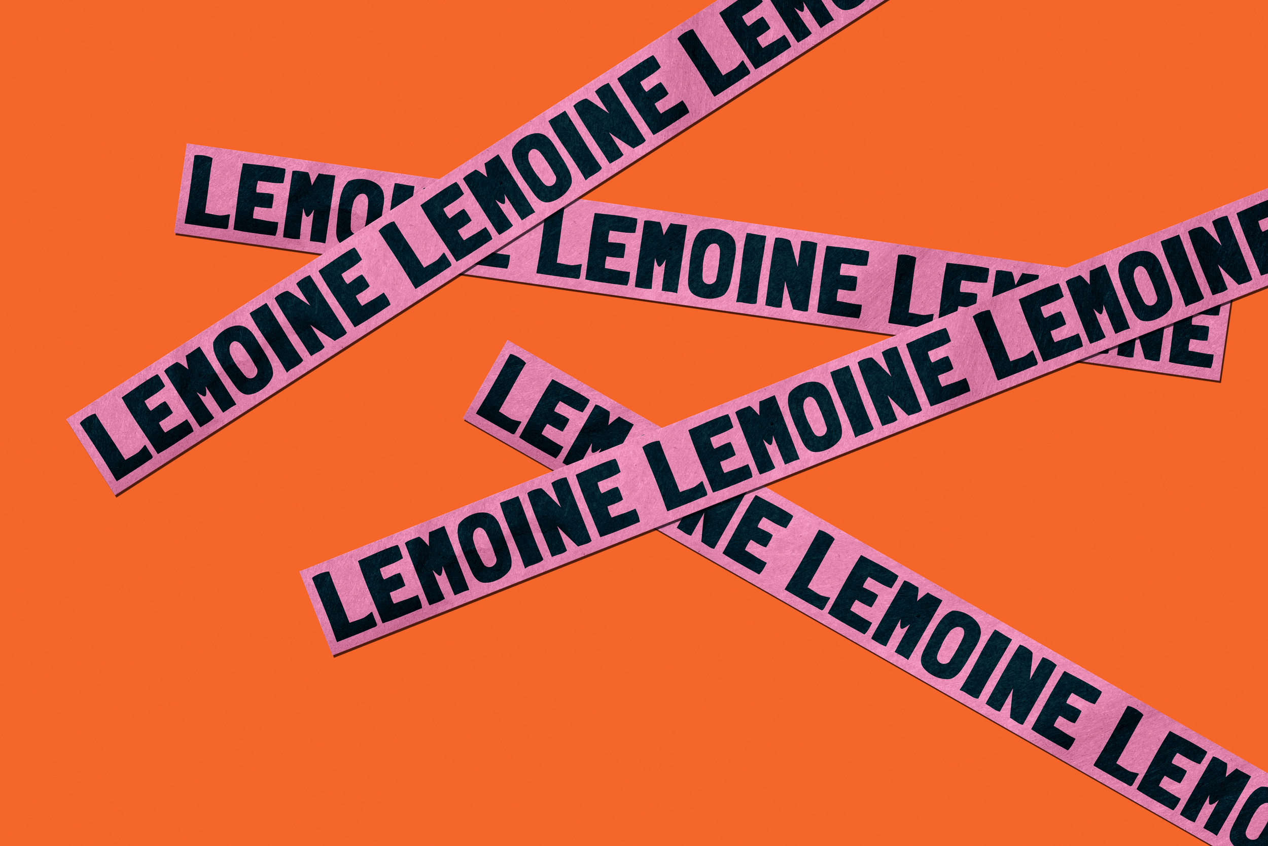
When Leslie started Lemoine her primary product offering was embroidered cocktail napkins. We discussed her goals for broadening her product line over time, so it was important that we came up with packaging that was versatile enough to be used on a variety of different shipping boxes, and also cost-effective for a small business in the early stages. Craft packaging fit in seamlessly with her hand-made goods, it paired nicely with her color palette, and was a cost-effective solution whether ordering flat mailers or larger shipping boxes.
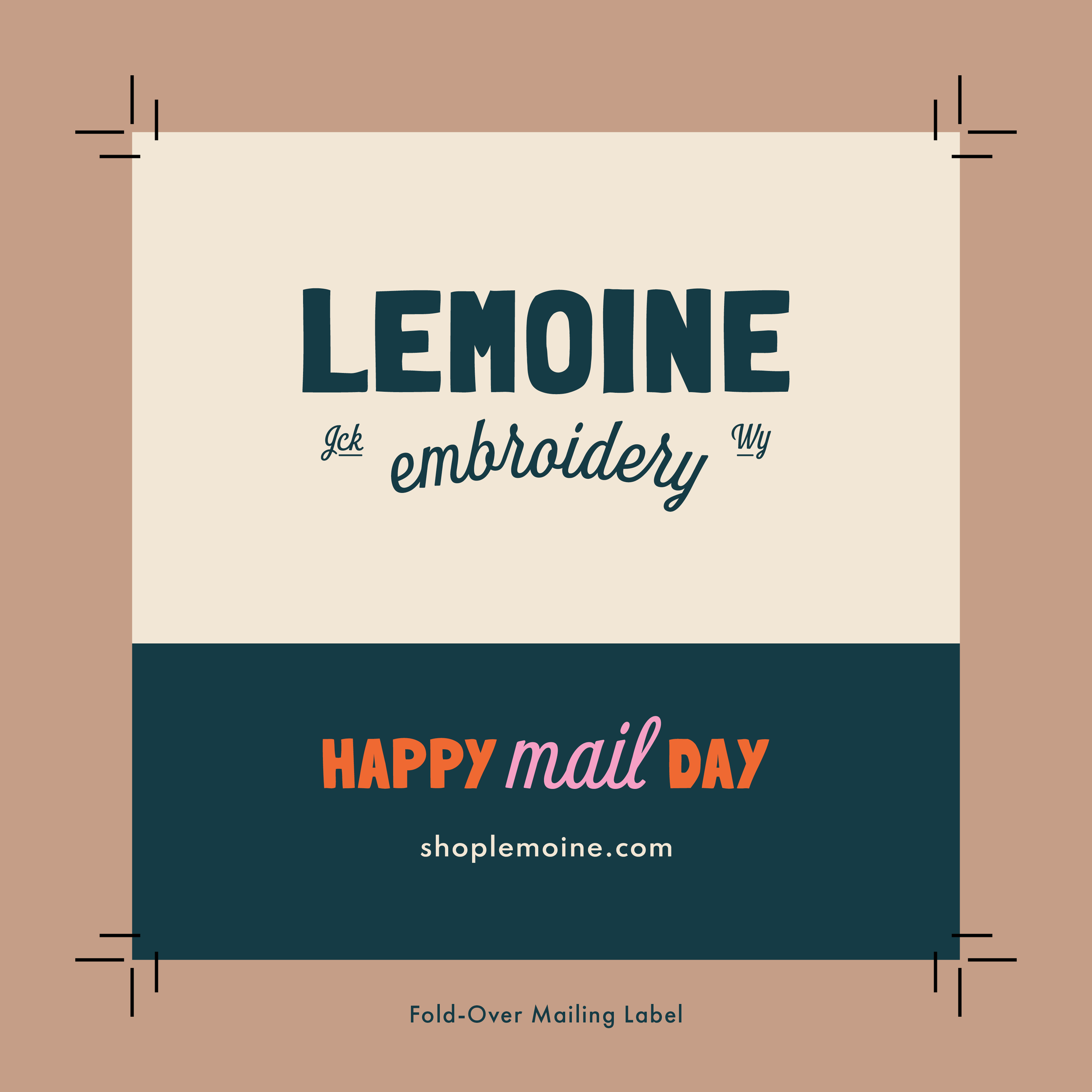
We designed colorful stickers, labels and tape for the exterior of packages for a fun mail delivery that was undeniably Lemoine. When customers open the packaging the happiness continues with custom tissue paper featuring the star pattern, and a hand-written card from Leslie thanking them for their purchase. I had the opportunity to come up with the phrasing used on the packaging and branded collateral, and I wanted it to be an extension of Leslie’s personality: bubbly, down-to-earth, and happy!