
Samadhi Yoga Minneapolis
“Working with Ashley far exceeded my expectations. From our initial concept exploration to receiving the finished files, every step of the process was smooth, thoughtful, and intentional. As a fellow creative, I have high expectations for quality of work and the details that are required to truly express the story of a brand. While working with Ashley I had full confidence that she was listening carefully, reading between the lines, and exploring every angle and perspective. She produced a logo and brand guide that was more vibrant than I could’ve imagined while staying true to our story and mission. She was able to guide me through the process and take ownership of every aspect of the design work. Ashley is a gifted creative, intelligent problem solver, energetic professional, and a joy to work with. I can’t wait to work together on more projects.”
A boutique style yoga studio that grounds itself in the roots of an authentic yoga practice. Samadhi is not like your typical Americanized yoga studio. You won’t find tons of hot yoga classes on their schedule with loud, pumped up music where you leave dripping with sweat. That plays no part in the traditions of yoga and what it’s meant to do with uniting your mind, body and soul.
Samadhi is an inclusive yoga studio where all walks of life are welcomed, and they even add my personal favorite touch, knowing everyone’s names that walk through the door.
Because they are such a unique yoga studio by honoring the cultural roots of a traditional yoga practice, it was really important to showcase that and their inclusivity by weaving it through all aspects of their branding.
The colors
The color palette was inspired by popular Indian spices, earthy tones and Balinese offering trays as well as traditional Balinese dresses with hues that are so vibrant and warm. It was important for the colors to feel energizing yet calming at the same time so I toned down the vibrancy of each while making sure to maintain their underlying energy so they don’t feel dull.
The fonts
I talked with the owner, Molly, about the importance of choosing a primary font for this brand that felt very authentic to what someone might see that practiced yoga in India or was familiar with its cultural roots. It was important to stay away from a trendy and modern sans serif which would have been the easy and most common route for a yoga studio. However, because we wanted to showcase how unique this boutique yoga studio is, that needed to come through especially in the font and logo as it’s typically the first interaction someone will have with the brand. If it were a modern sans serif font, the uniqueness of the brand would have immediately gone out the window.
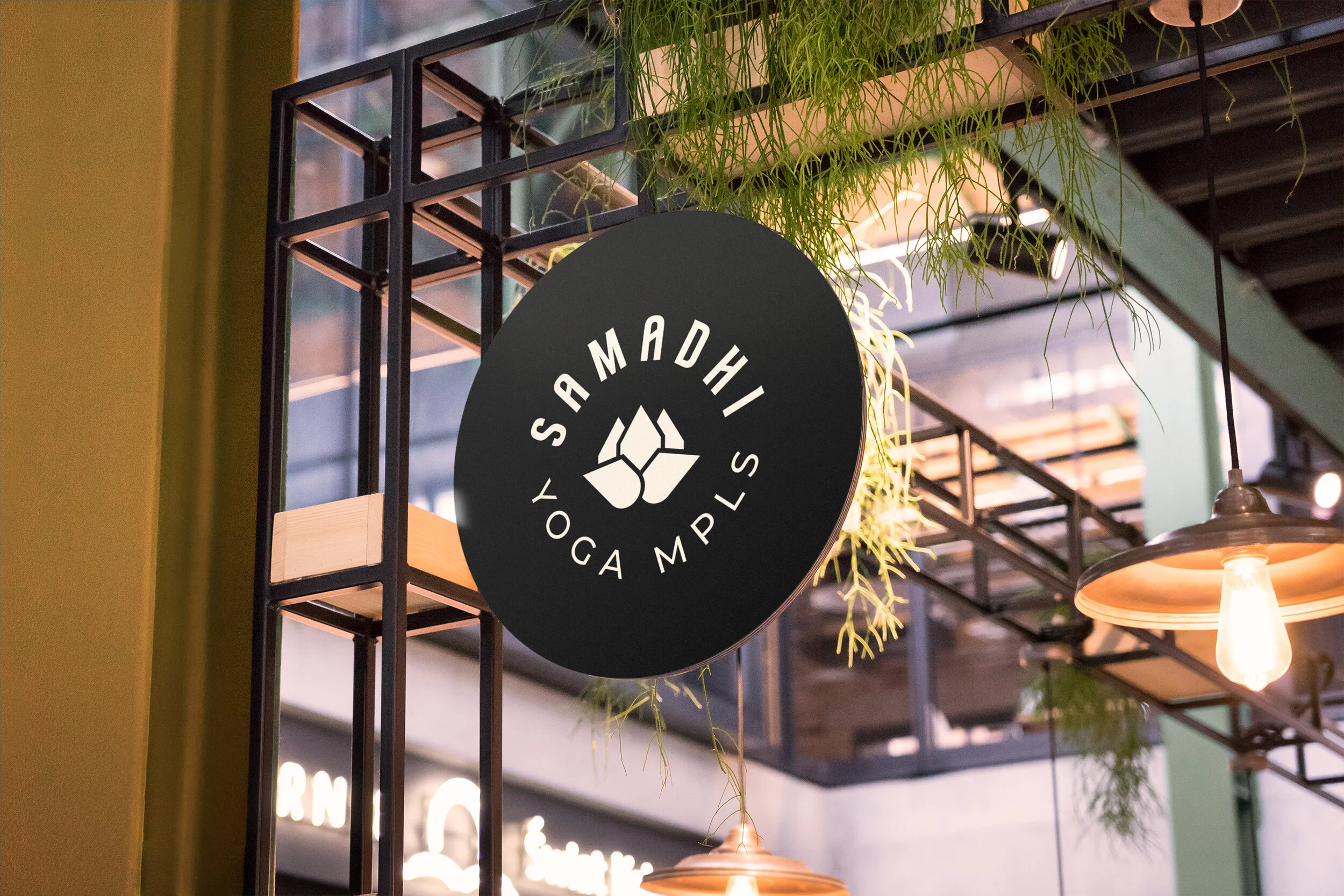
The icon
Samadhi (sa·ma·dhi) is a sanskrit word that means “total self-collectedness”. I wanted to create an icon that represented that purity of mind and was connected to the roots of yoga but also took on a unique approach that felt new. After several iterations, I landed on the lotus flower. In Hinduism, a lotus flower is associated with being grounded in the highest level of enlightenment. It also represents purity and rising above problems we struggle with and material temptations. The lotus yoga pose is also one of the most fundamental poses used to practice meditation and mindfulness. The lotus flower thus seemed like a perfect fit to represent Samadhi Yoga and the icon was created to represent the flower mixed with the body position in Lotus Pose.


